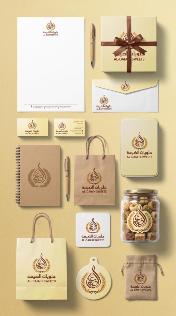
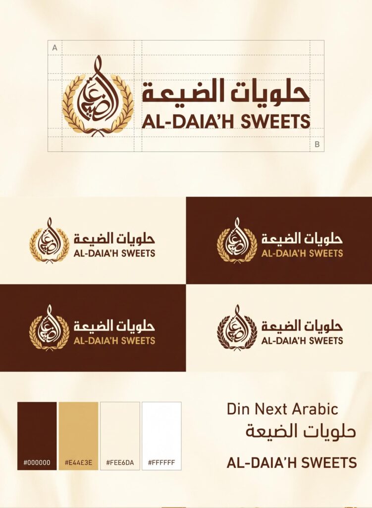
The logo design for “Al-Dai’ah Sweets” is based on a visual philosophy that combines rural authenticity, luxury, and high quality. The symbolic and philosophical meanings of the logo’s elements can be divided into three main sections:
1. The Two Wheat Ears — A Symbol of Prosperity and Authenticity
Connection to the name and place:
The wheat ears surround the calligraphic mark, reinforcing the meaning of “Al-Di’a”, which refers to the village or countryside. Wheat symbolizes the land, nature, and abundant harvests.
Quality of ingredients:
In the world of sweets and baked goods, wheat represents natural and pure raw materials, such as flour and other fresh essential ingredients. This gives consumers a sense of natural production, high quality, and authentic traditional recipes.
2. The Water Drop or Calligraphic “Tear” — The Visual Form of the Lamp/Drop
Fluid appearance:
The upper calligraphic form of the word “Al-Di’a” takes an outer shape resembling a drop or an elevated crescent. In the philosophy of Middle Eastern sweets, the drop is naturally associated with “qatir” (syrup or sweet glaze)—the syrup used to enhance traditional sweets and give them their distinctive taste.
Symmetry and balance:
The flowing lines and their upward movement give the logo a sense of visual stability while naturally attracting the eye. They also suggest growth, elevation, and aspiration.
3. The Colors — Gold and Brown
Gold in the wheat ears:
Gold symbolizes luxury, distinction, and superior quality (Premium Quality). It communicates that Al-Di’a’s products are not simply ordinary sweets, but are presented as a premium hospitality experience.
Brown in the typography:
Brown represents the earth, coffee, chocolate, and freshly baked goods. It is a warm color that evokes feelings of familiarity, heritage, comfort, and the family traditions associated with the atmosphere of the countryside.