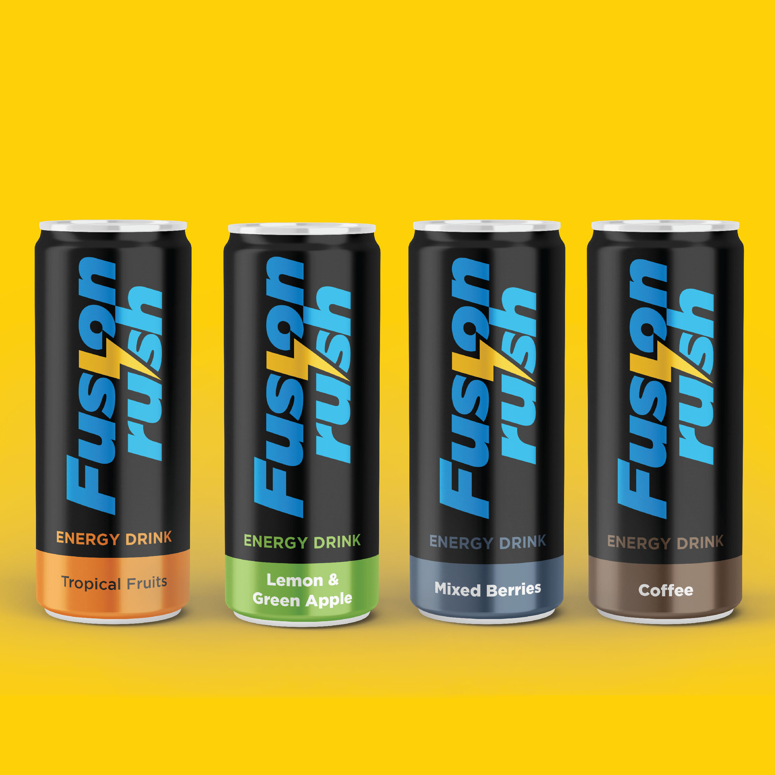
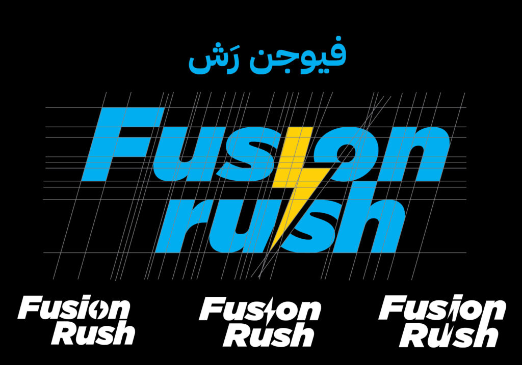
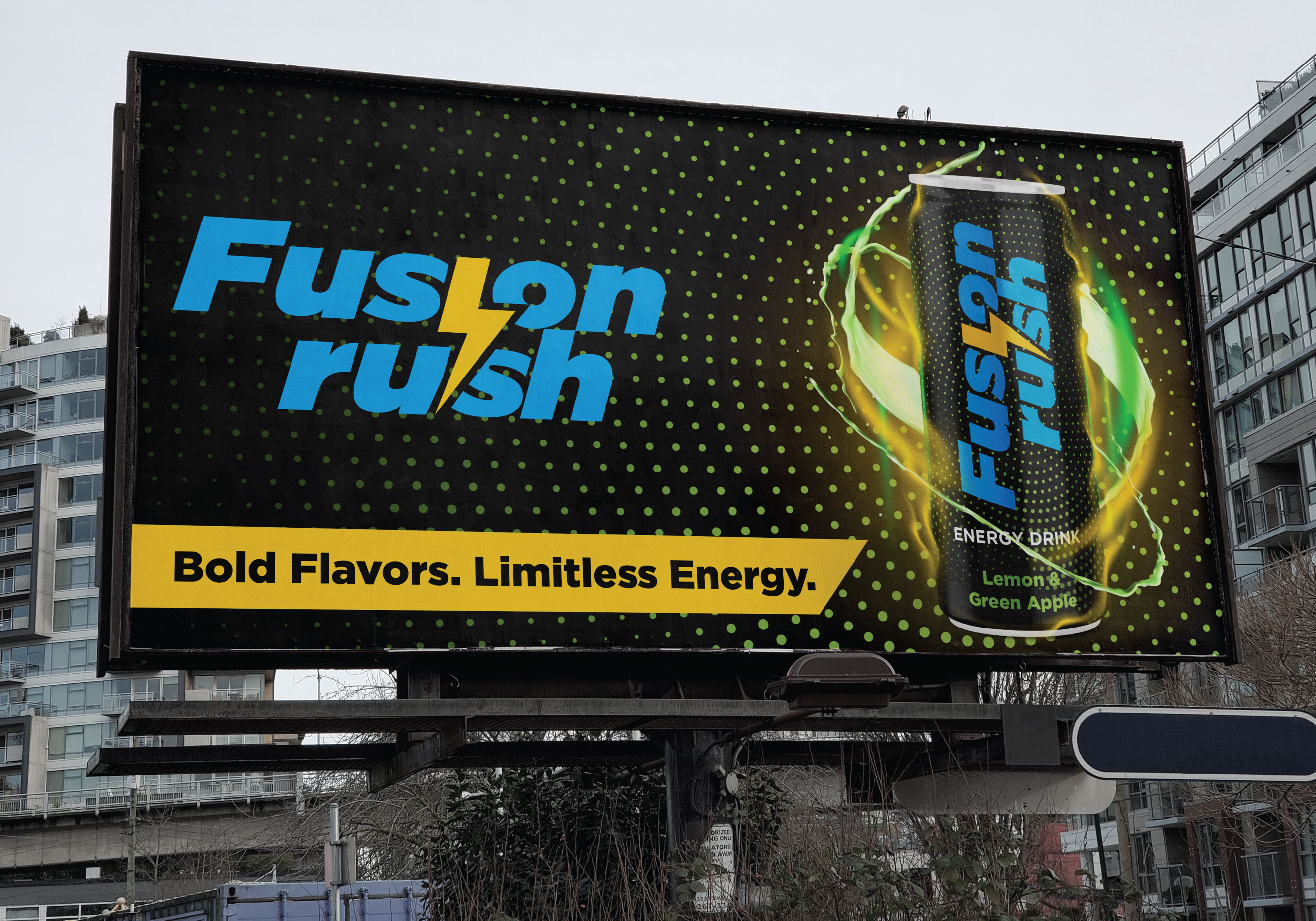
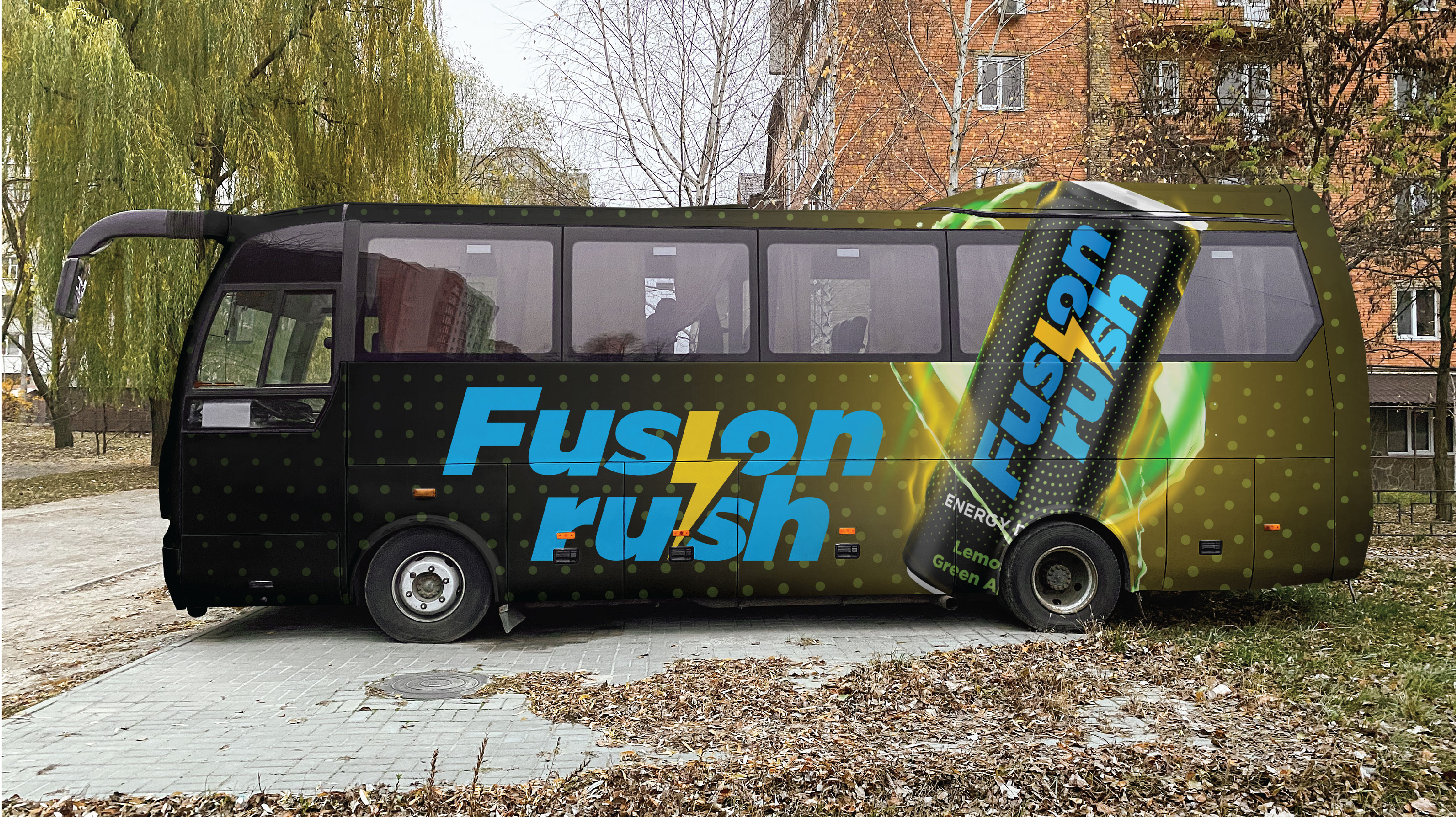
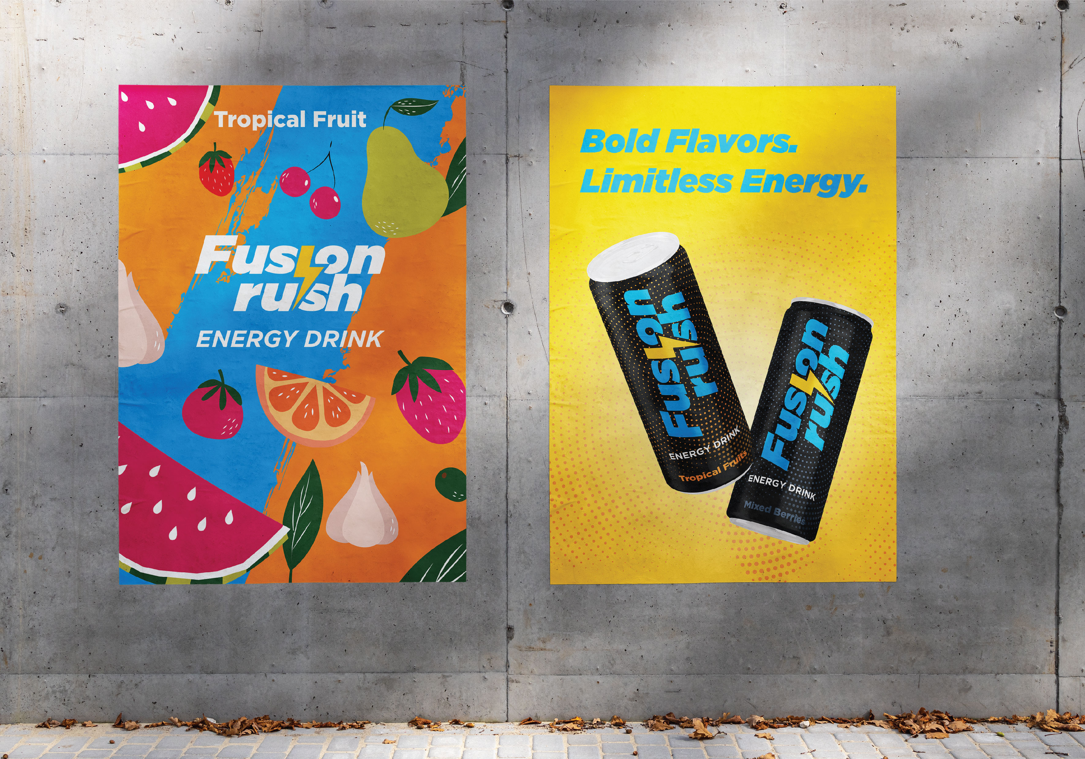
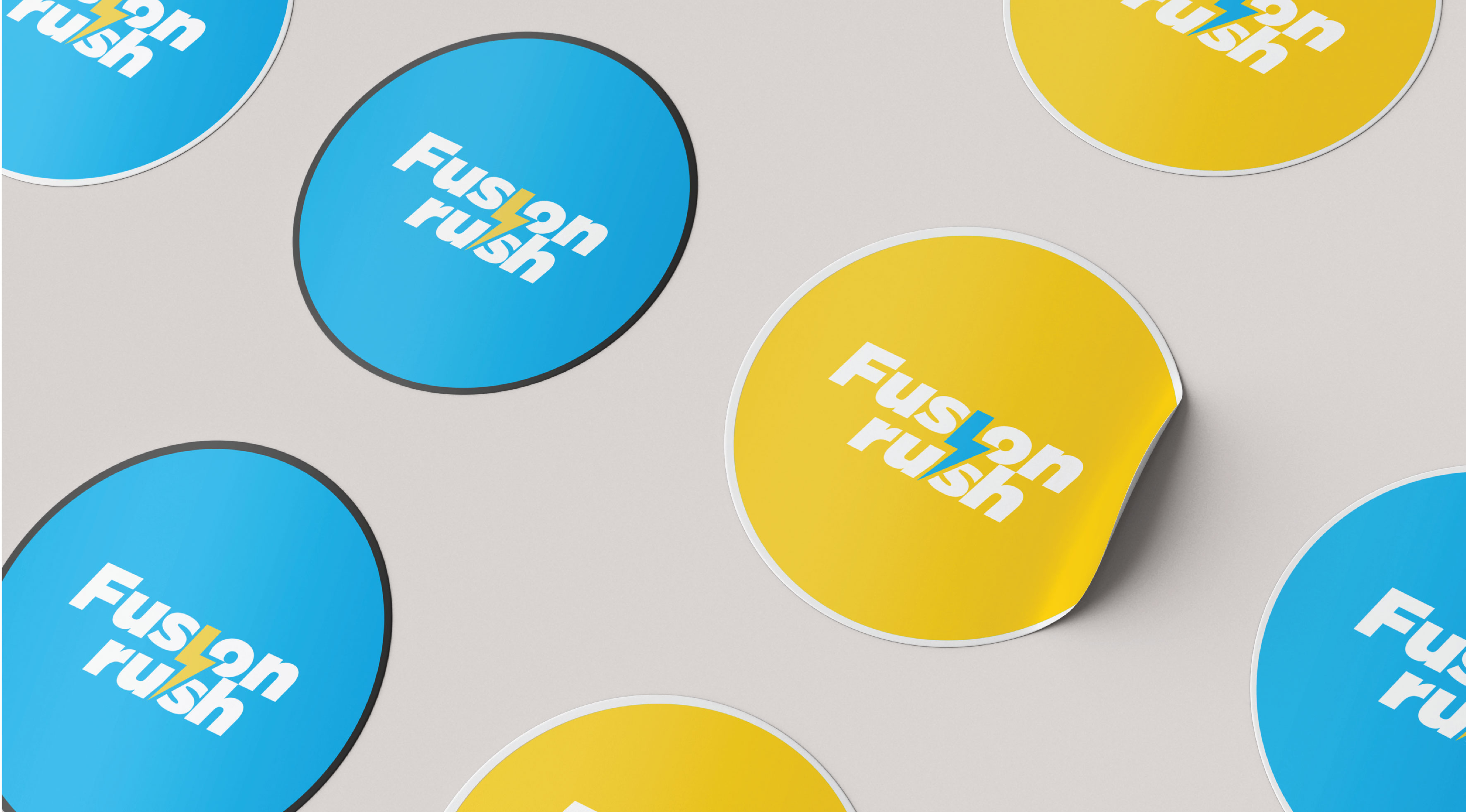
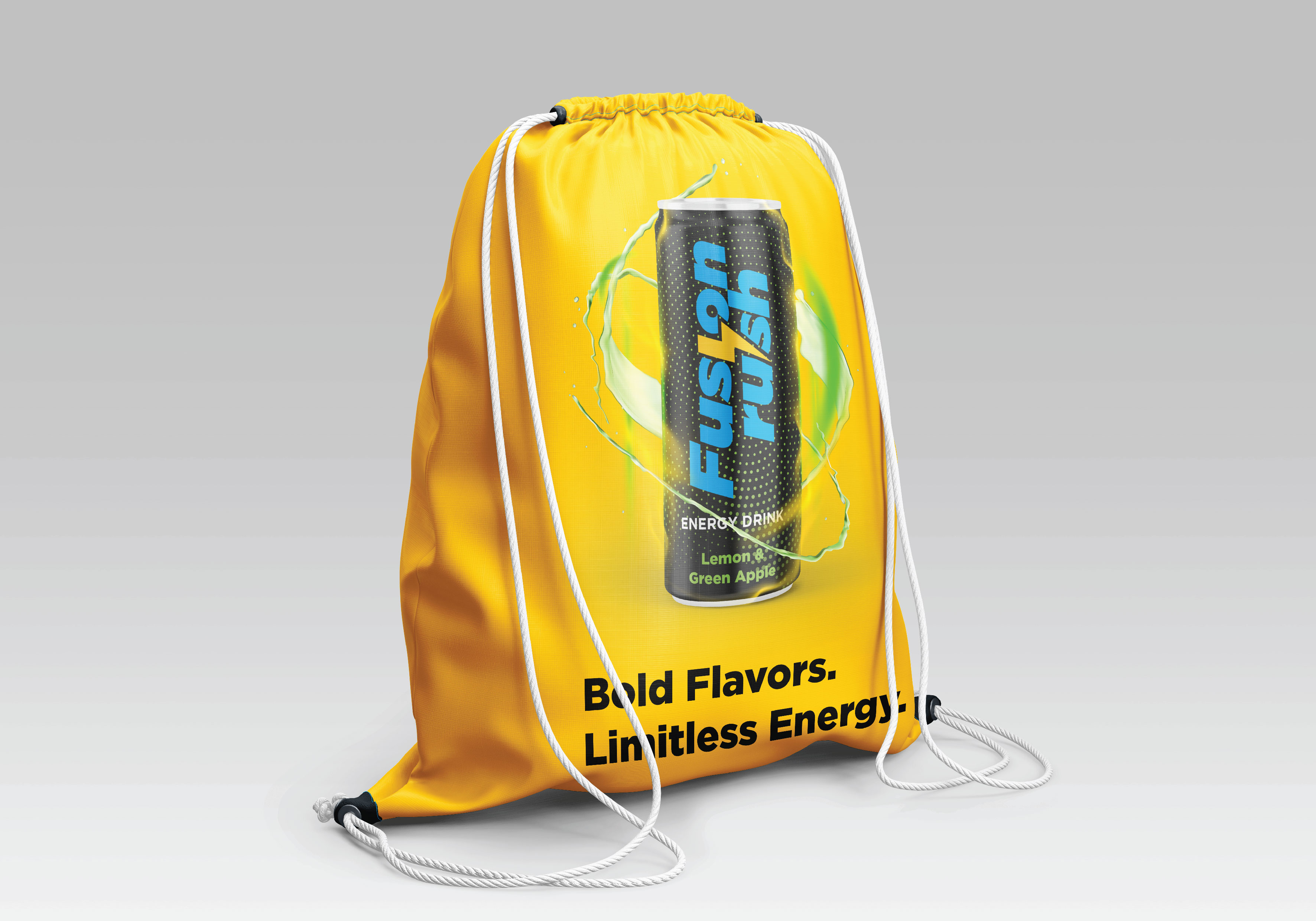
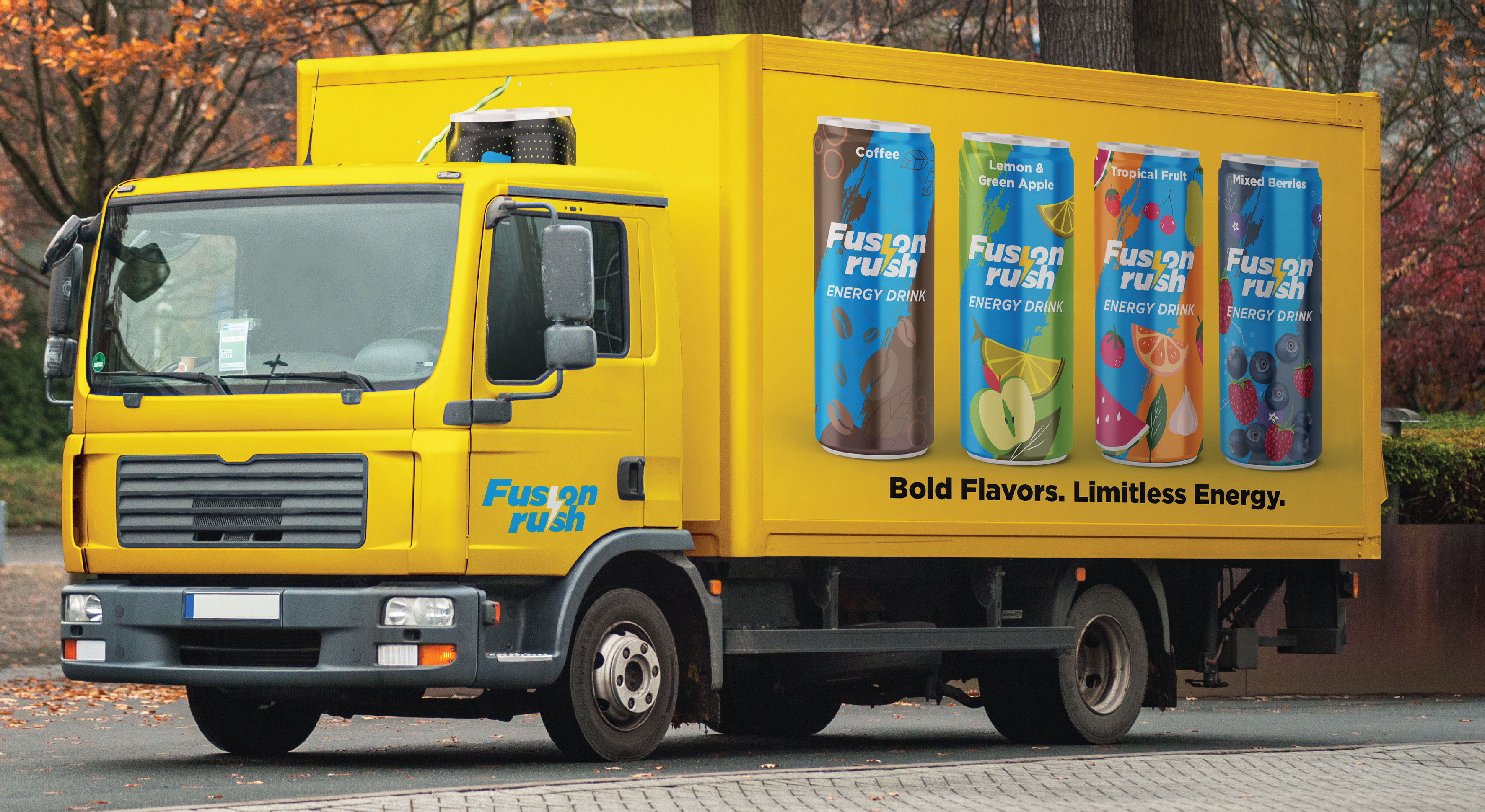
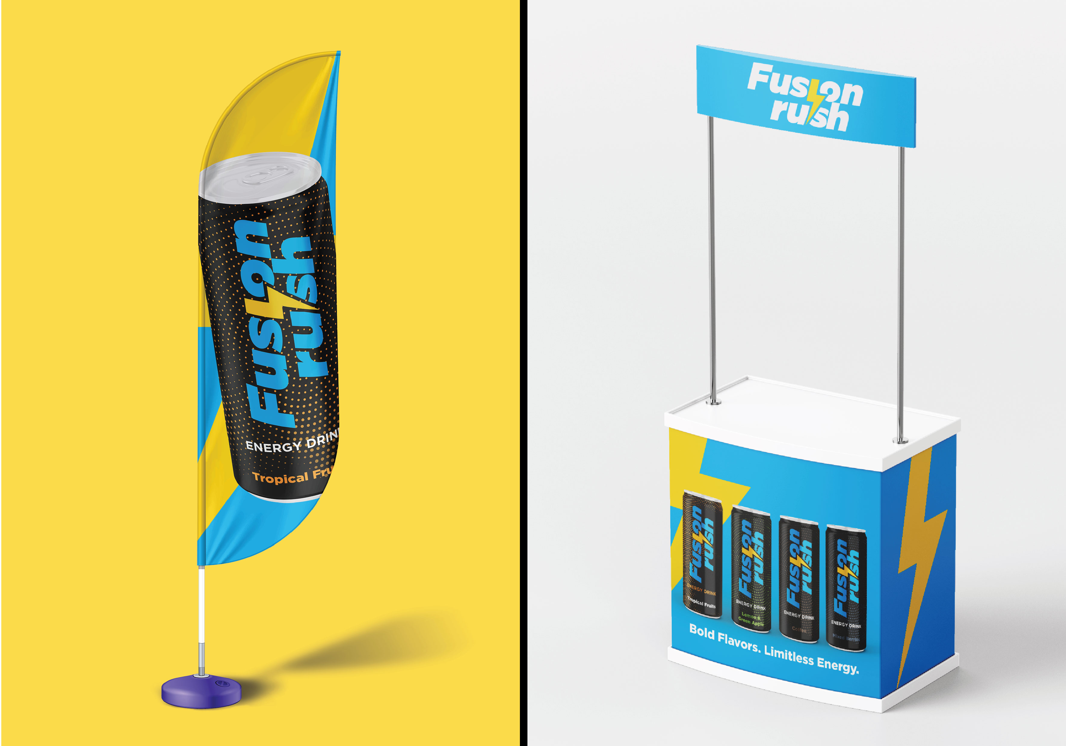
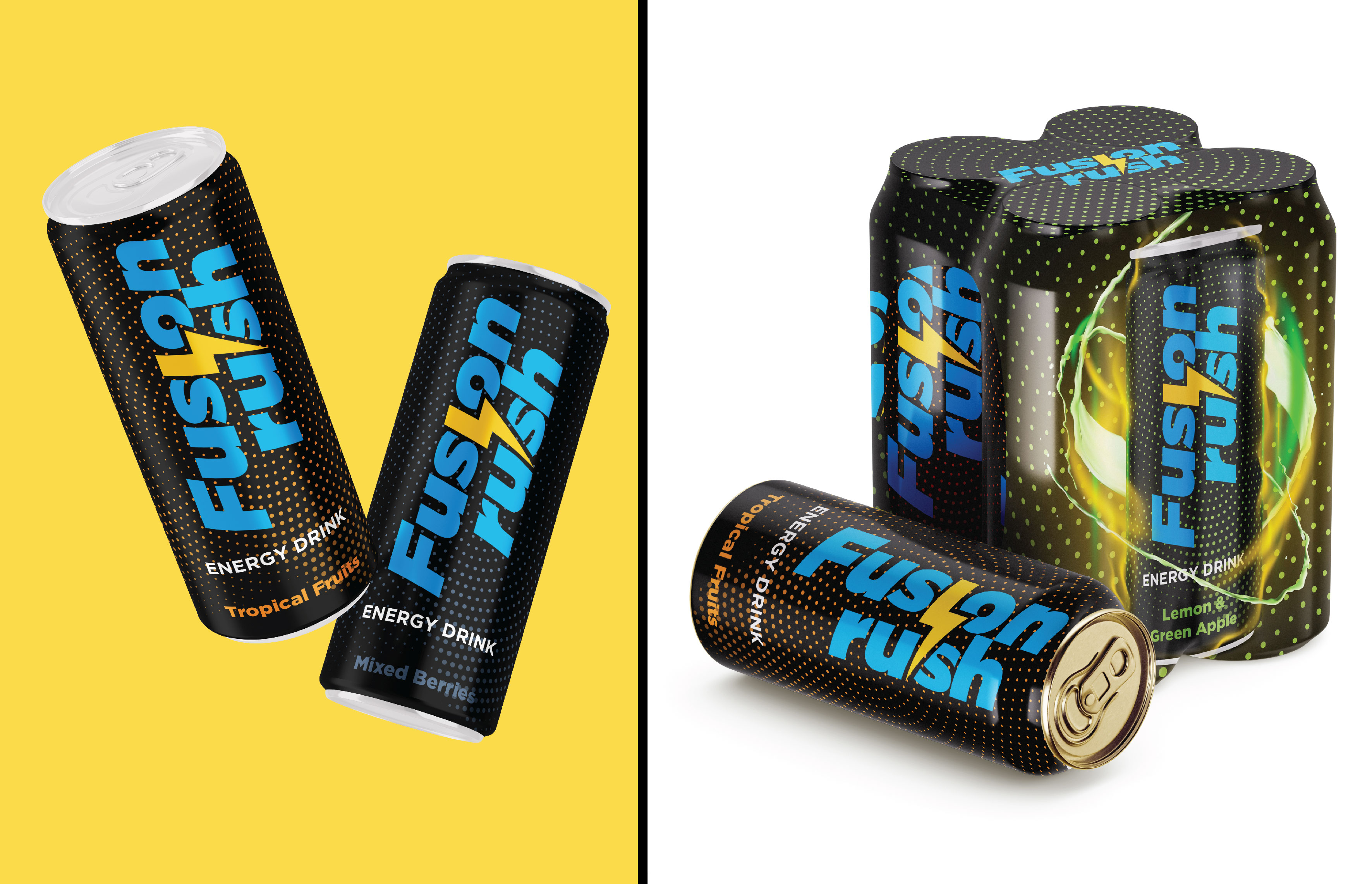
I chose for the brand logo the font “Gotham” in its italicized version. “Gotham” is characterized by a fashionable and stylish line that attracts the youth category while maintaining its professional character, ensuring a luxurious and attractive appearance at the same time. The wide oblique “Gotham” line brings vitality and movement, visually reflecting the sense of speed and momentum that the brand name implies. I also wanted to add a touch of energy, so I added the lightning icon. Lightning is a universal symbol of energy, speed and power, which makes it an ideal representation of the product. Its strategic placement in the logo reinforces the idea of an instant energy “rush”, visually anchoring the brand’s message. Lightning also lends a dynamic design element, adding vitality and accentuating the logo on all packaging and marketing materials.
I chose yellow and blue colors. Symbolizing energy, positivity and vitality, yellow is perfect for highlighting the essence of a lively energy drink. Its high clarity ensures that the product stands out on store shelves and attracts attention, especially among the youth category. The blue color inspires confidence, freshness and concentration, adding a calm and cool balance to the vibrant yellow. Blue is also associated with the concepts of endurance and performance, which makes it attractive to athletes and ambitious individuals. When combined together, the high contrast between yellow and blue forms a bold and eye-catching aesthetic, reinforcing the brand’s identity as an innovative and vibrant brand. Together, the colors reflect the dual promise of excitement (yellow) and reliability (blue), which is key to gaining consumer confidence in a competitive market.