How do you make “organic” feel authentic rather than predictable?
The organic food category is crowded with familiar visual codes:
Green leaves
Generic farm illustrations
Brown kraft packaging
Handwritten typography
Rustic photography
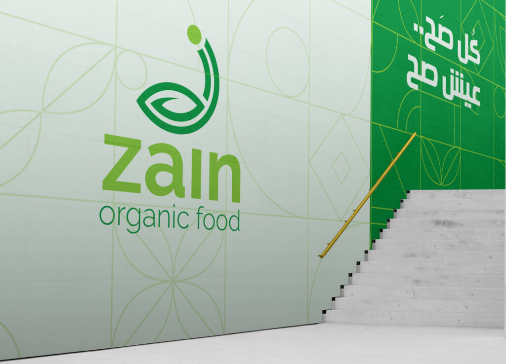
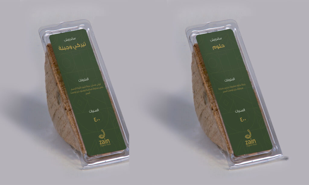
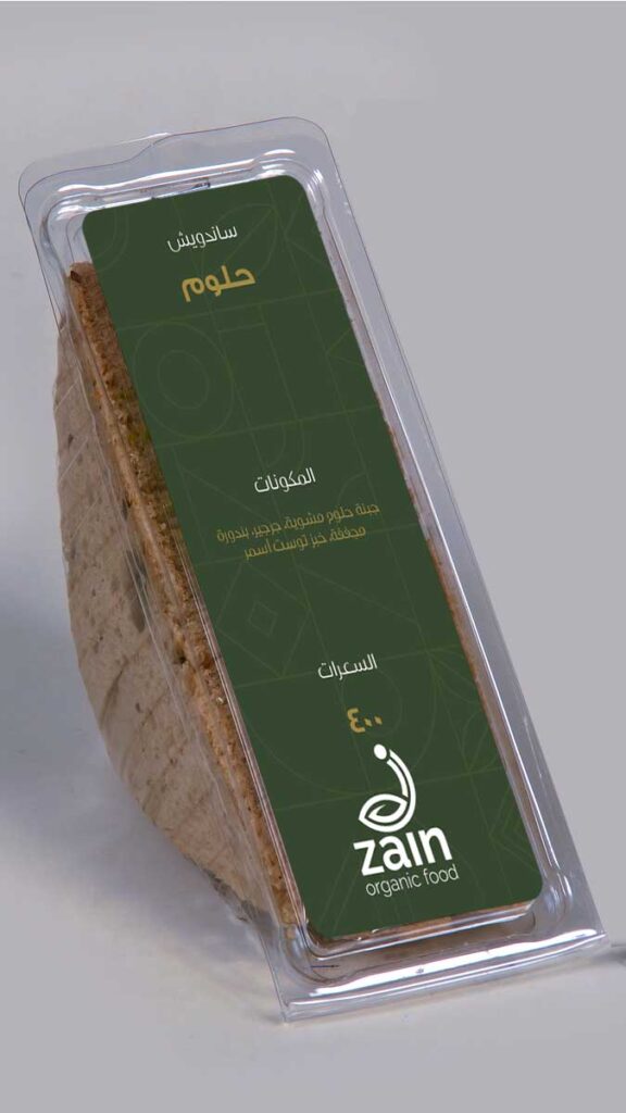
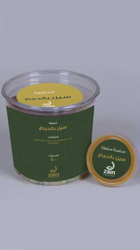
The challenge was to create something that could communicate nature and authenticity without becoming visually generic.
Zain Organic Food needed to feel:
Natural — Trustworthy — Modern — Premium — Approachable
The identity therefore needed to bridge two worlds:
The authenticity of nature + the professionalism of a modern food brand.
Category:
Branding/Packaging
Client:
Zain Organic Food
02 — BRAND STRATEGY
Brand Positioning
The brand was positioned around the idea of bringing the goodness of nature into everyday life.
Rather than presenting organic food as an exclusive lifestyle product, the brand personality was designed to make natural food feel:
simple, accessible and trustworthy.
Brand Promise
Pure food. Honest origins. Better choices.
The promise is built around three fundamental consumer expectations:
PURPOSE: Why the product exists.
PURITY: What goes into it.
TRUST: What the customer can believe.
03 — DESIGN PHILOSOPHY
LESS “ORGANIC.” MORE AUTHENTIC.
A common mistake in organic branding is trying too hard to look organic: Leaves everywhere. Brown paper everywhere. Handwritten fonts everywhere.
Zain’s design direction takes a more strategic approach:
Nature should be communicated through authenticity, not visual clichés.
This creates a brand that feels contemporary enough for modern retail while maintaining its natural credentials. The visual direction was designed around the idea that food should look desirable before it looks “healthy.”
This is an important distinction: Consumers don’t simply buy organic food because it is organic.
They buy because they want:
taste + quality + trust + lifestyle + wellbeing.
Therefore, the visual communication needs to make the product emotionally desirable, not merely technically credible.